
How to Create a High-Converting Landing Page (The Right Way, No Nonsense)
Understanding What a Landing Page Is (And What It’s Not)
Updated: 06/08/2025
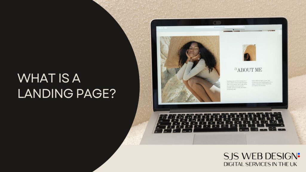
First of all, many people get confused: a landing page is not a website. And it’s not necessarily a one-pager either.
A landing page has a very specific purpose — conversion. It’s about turning visitors into clients. It’s guiding someone towards a single action.
A regular website can serve multiple purposes: telling a company’s story, displaying a portfolio, hosting a blog… It’s more institutional. A landing page is surgical. Direct. It has one mission only: get the person to click that button, hire your service, buy your product.
That’s why everything must be optimized. No distractions. No ‘I’ll check it later’. Every element is designed to guide the user to convert.
A landing page can be created by using many different tools, and it can be developed using WordPress or tools like GoHighLevel. It’s not hard to do, but if you don’t have the experience, you can outsource it from a web development company.
You Only Have 8 Seconds
And here comes the first dose of reality: you’ve got eight seconds. That’s it. According to recent studies, this is the average time you have to capture someone’s attention before they think of leaving your page. Eight seconds. It’s a blink.
So what comes first? What stands out? How are visual elements arranged? All of this should direct the user’s eyes to your action button — the famous CTA (call to action).
The More Landing Pages, The More Results
Here’s a stat: companies with more than 40 landing pages generate 12 times more leads than companies with five or fewer.
In other words, if you’ve only got one landing page for your product, you’re leaving money on the table. Try different formats. Change the title, switch the proposal. Segment by audience. Increase your chances.
But What’s a ‘Good’ Conversion Rate?
Do you know the average conversion rate for an optimised landing page?
If you guessed 20% or 30%… brace yourself: it’s between 2% and 5%.
Yeah. It’s low. That’s why every little detail counts. A sharper headline, a more visible button, tighter copy — all of it can make a difference.
And here’s the kicker: if you create specific landing pages for each product, you can increase conversion by 48%. That’s nearly double. All thanks to a well-structured layout.
Structure of a High-Converting Landing Page
Let’s break this down. Here’s the real structure of a high-converting landing page:
1. Killer Headline
It’s your business card. The first thing people see. It needs to create curiosity and instantly show your product’s main benefit.
Example: you’ve got a CRM. Instead of “The best CRM in the market”, which is vague and means nothing, try:
“Double your productivity in 2 weeks with our CRM.”
See the difference? Now there’s a metric, benefit, and timeframe. The reader thinks “How? I want to know more.”
2. Persuasive Copywriting
A great title isn’t enough. The page content must also shine. This is where persuasive copywriting comes in. A classic structure you can follow is called AIDA:
- Attention
- Interest
- Desire
- Action
You grab attention, hold interest, spark desire, and drive action. Simple and effective.
3. Clear, Visible CTA
Don’t hide the button. Don’t confuse the user. The action button should stand out. “Buy now”, “Get access”, “Start for free”. Whatever it is — it must be clear and visible.
Clean, Smart Design
Landing page design isn’t for show. It’s to convert. The simpler and more objective, the better.
Avoid clutter, 15 different colours, or endless animations. No. The information hierarchy must be crystal clear.
A concept I love is skimmable reading: one glance and you understand what it’s about. No need for chunky paragraphs. Just a glance should be enough.
Oh, and colours? Use them intentionally. There’s a whole psychology behind colours. They trigger emotions. Want to convey trust? Safety? Desire? That’s all possible with colour — and nowadays, even AI can help you choose the perfect palette.
Performance: Speed Is Everything
There’s no point in a beautiful page if it takes 10 seconds to load. No one’s going to wait. Google says 53% of people leave if a page takes more than 3 seconds to load. Speed is life.
Practical tips:
- Compress your images. Use modern formats, no 3MB PNGs.
- Enable browser caching.
- Invest in decent hosting. HostGator, for instance, includes CDN by default — which greatly improves performance.
- Enable a CDN (Content Delivery Network). That alone can cut loading times in half.
Responsiveness is Essential
Over 60% of visits come from mobile devices. Your landing page needs to adapt flawlessly to every screen. Not just layout-wise, but also in loading time.
Think about it: when was the last time you bought something online using a computer? Chances are, it was on your phone.
SEO: Your Page Needs to Be Found
Optimising your landing page for search is crucial. Use metadata, keywords, and an optimised description. If you’re using WordPress, plugins make this much easier.
Yes, You Can Create a Landing Page with AI
There’s a tool that uses AI inside HostGator’s WordPress. You describe your product, define your audience, list the benefits — and it generates a fully optimised landing page for you: headline, copy, design, CTA, SEO.
You can customise everything later, but the base structure is ready — fully focused on conversion. It’s insanely practical.
A/B Testing: Never Stop Optimising
A good landing page is one that’s always being tweaked. Test titles, change buttons, try new colours, different copy versions. And track your metrics.
WordPress has analytics plugins. That way, you can see which part of the page converts best, where people click, and where they drop off. Then adjust accordingly.
A landing page is never ‘done’. It’s always evolving.
Final Thoughts: Entrepreneurship Is Connecting Technique with Strategy
If you truly want to become an online entrepreneur, it’s not enough to build a cool product. You need to sell it. You need to solve a real problem and communicate that clearly.
That’s where the landing page comes in.
When you blend technical skills, digital strategy, and solid sales execution — that’s when you truly give your product a chance to take off.
Take advantage of the moment we’re living in. Use AI to your favour, streamline your process, and start building something real. You can do a lot with little nowadays.
So, ready to put this into practice?